

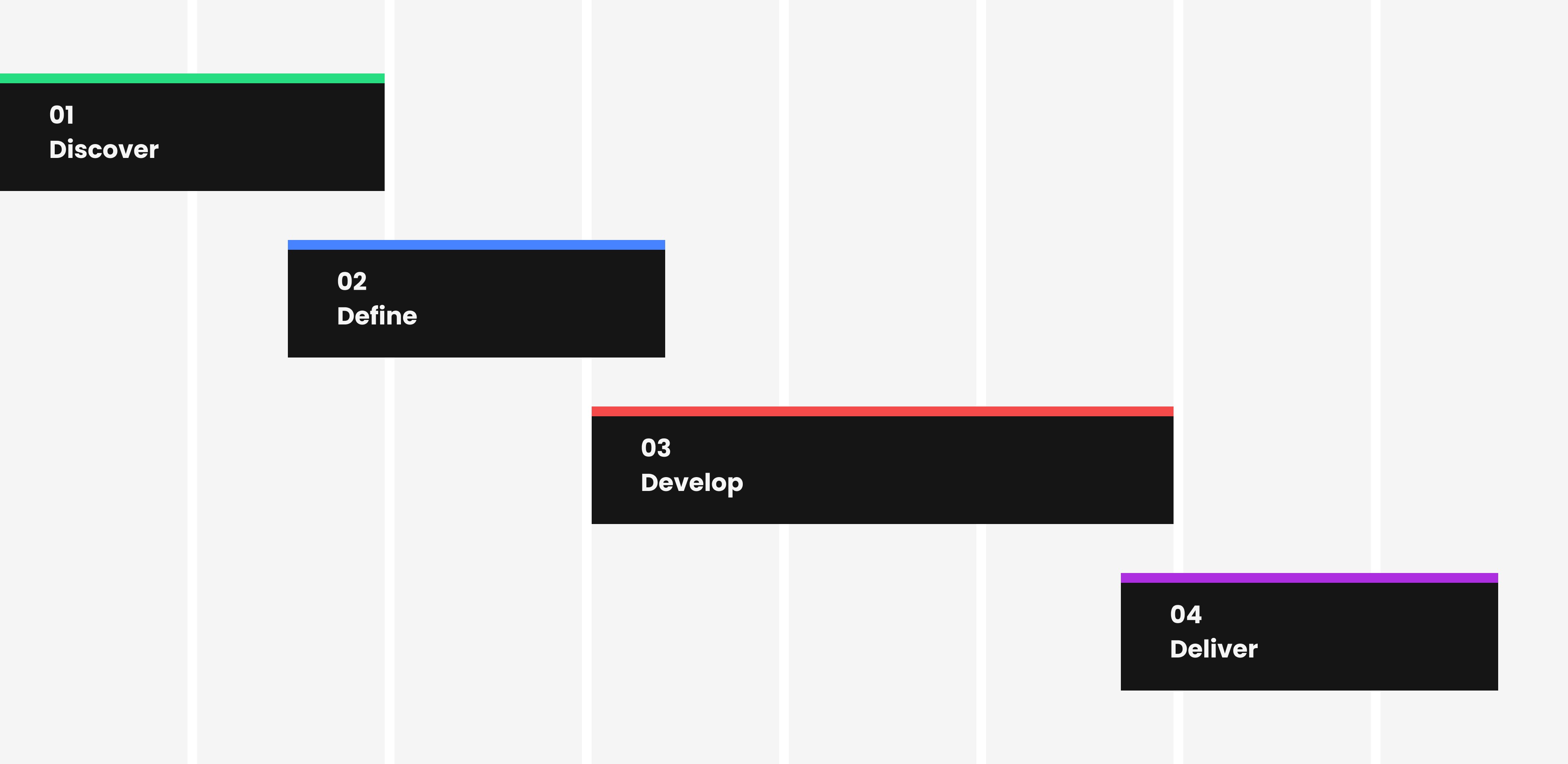
Weeks
Competitor research
Stakeholder interview
UX audit
User interview
Weeks
User persona
Problem statements
User flow
Weeks
Low-fidelity wireframe
High-fidelity wireframe
Responsive design
Technical documentation
Weeks
Developer handoff
Monitor implementation
Research
Based on G2 ranking, we identified several notable competitors such as Getaccept, Dealhub, Relayto, Allego, Showpad.
10
Competitors
12
Popular features
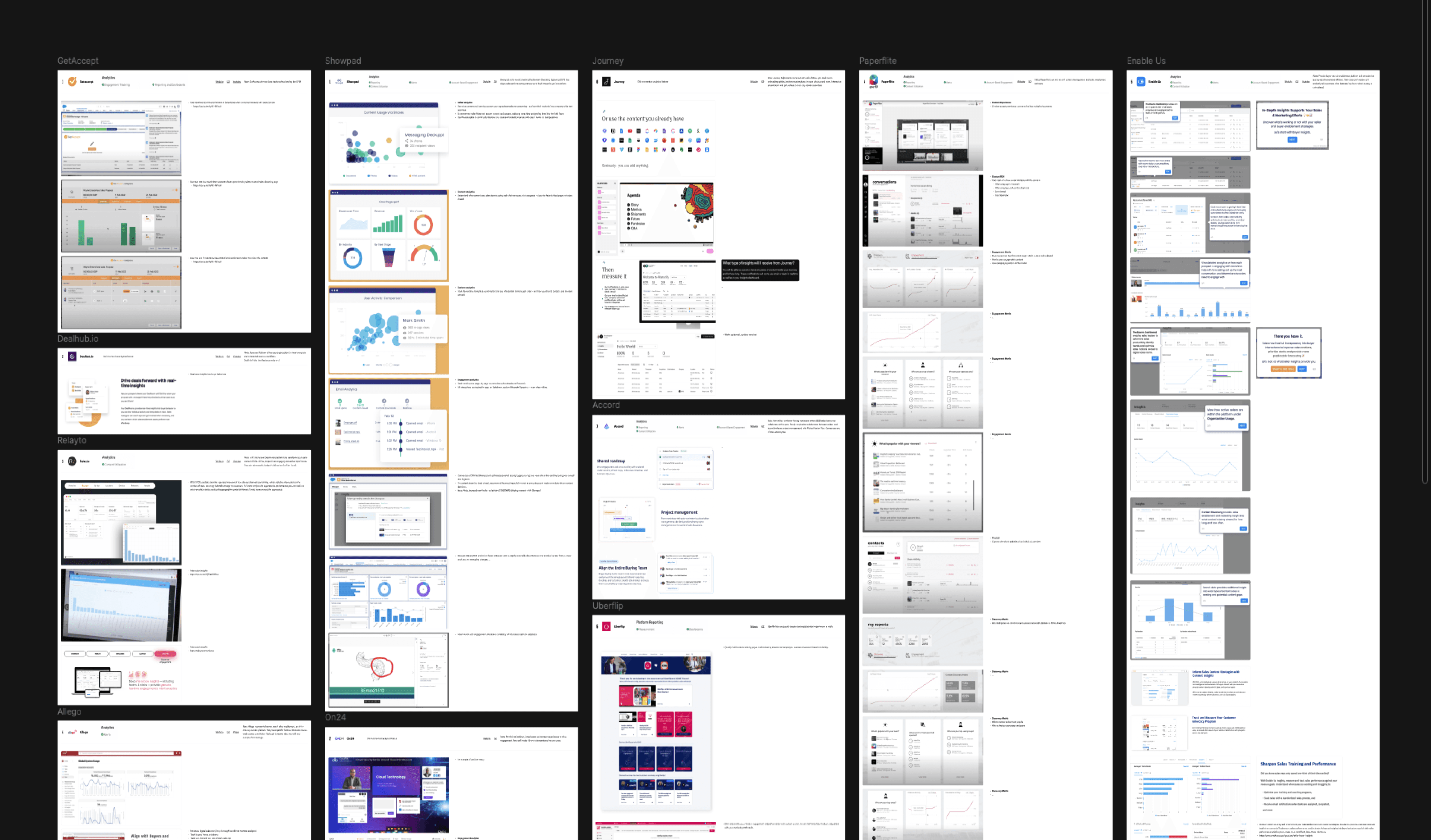
Key Findings
Below are the top three key insights having significantly influence on our design direction.
Several competitors have integrated real-time data tracking, enabling users to monitor key metrics and respond immediately to changes.
Top competitors excel in using charts that effectively display trends over time, helping users quickly identify patterns and make data-driven decisions.
Leading platforms track overall engagement of an individual across multiple interactions, providing a comprehensive view into a buyer’s journey.
Persona
04
Creating personas helps us understand user needs and behaviors, guiding decisions to ensure solutions meet real user expectations.

Anna Richards
Sales Manager
Age: 35
Location: Germany
Anna manages deal progress on the SP_CE platform daily. She needs tools to track customer interactions and update sales materials to effectively close deals.
Goals
Monitor and increase sales performance.
Update sales materials efficiently.
Have real-time data to make quick decisions.
Challenges
Limited understanding of complex interface.
Finding reliable and easy-to-understand insights.
Tracking every buyers for accurate sales process.
Needs
A high-level overview dashboard of buyer data.
User-friendly interface
Track high-potential buyers in real-time.
Problem & Solution
Through stakeholder interviews, 18 user interviews and internal UX audit, we found the key problems affecting the core user experience.
Problems
1
Users are not fully utilizing the analytics feature to track interactions
2
The analytics dashboard did not provide relevant data to meet the users’ needs.
3
Users were confused about the definition of the key metrics.
4
Users found the dashboard design was inconsistent and difficult to use.
5
Users find the loading time slow, and the data isn’t updated in real-time, raising concerns about data reliability.
6
Users voted for comprehensive customer tracking.
Solutions
1
Rethink and rebuild the outdated analytics dashboard to satisfy and motivate users.
2
Conduct user and competitors research to better understanding the user’s needs.
3
Create a simple and intuitive interface with clear icon, easy-to-understand charts with proper tooltip and tutorials.
4
Ensure a design system is in place to give our users a delightful, consistent experience.
5
Collaborate with development team to optimize performance challenges.
6
Build a customer holistic tracking feature to provide personalized insights.
Design principles
06
I established a set of guiding principles to ensure a successful implementation, helping the team align decisions with project goals and user needs.
Relevancy
Ensure that only relevant data is displayed in the dashboard to meet user needs.
Clarity
Clearly explain how data is tracked and calculated to build trust and help users understand the insights.
Performance
Ensure that the dashboard loads quickly and that data updates are processed efficiently.
Data Visualization
Choose the right type of visualizations that best represent the data and are easy to interpret.
project goals
07
We defined key objectives to guide design decisions and ensure alignment with the overall business strategy and among the team.
Improve user engagement
Increase the number of users utilizing the analytics feature to gain valuable insights into buyers’ journey.
Enhance user experience
Create an analytics dashboard that delivers timely, relevant data with an intuitive and visually appealing design.
Boost customer retention
Leverage the new analytics dashboard as a channel to inform, delight, and motivate existing customers.

user flow
08
Before diving into ideation, our design team held a workshop to define an intuitive user flow that matches our user’s expectations & needs.
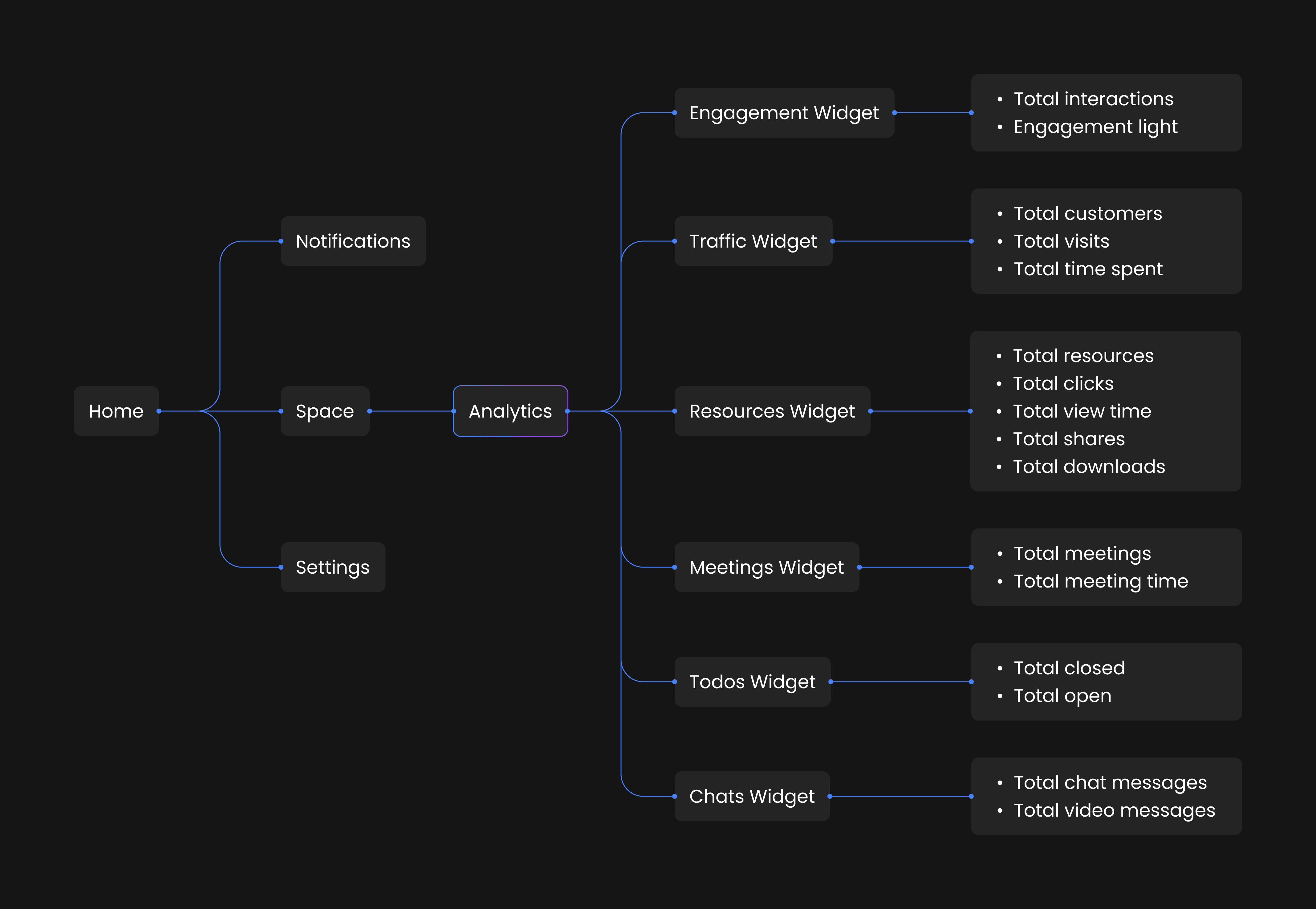
Wireframe
09
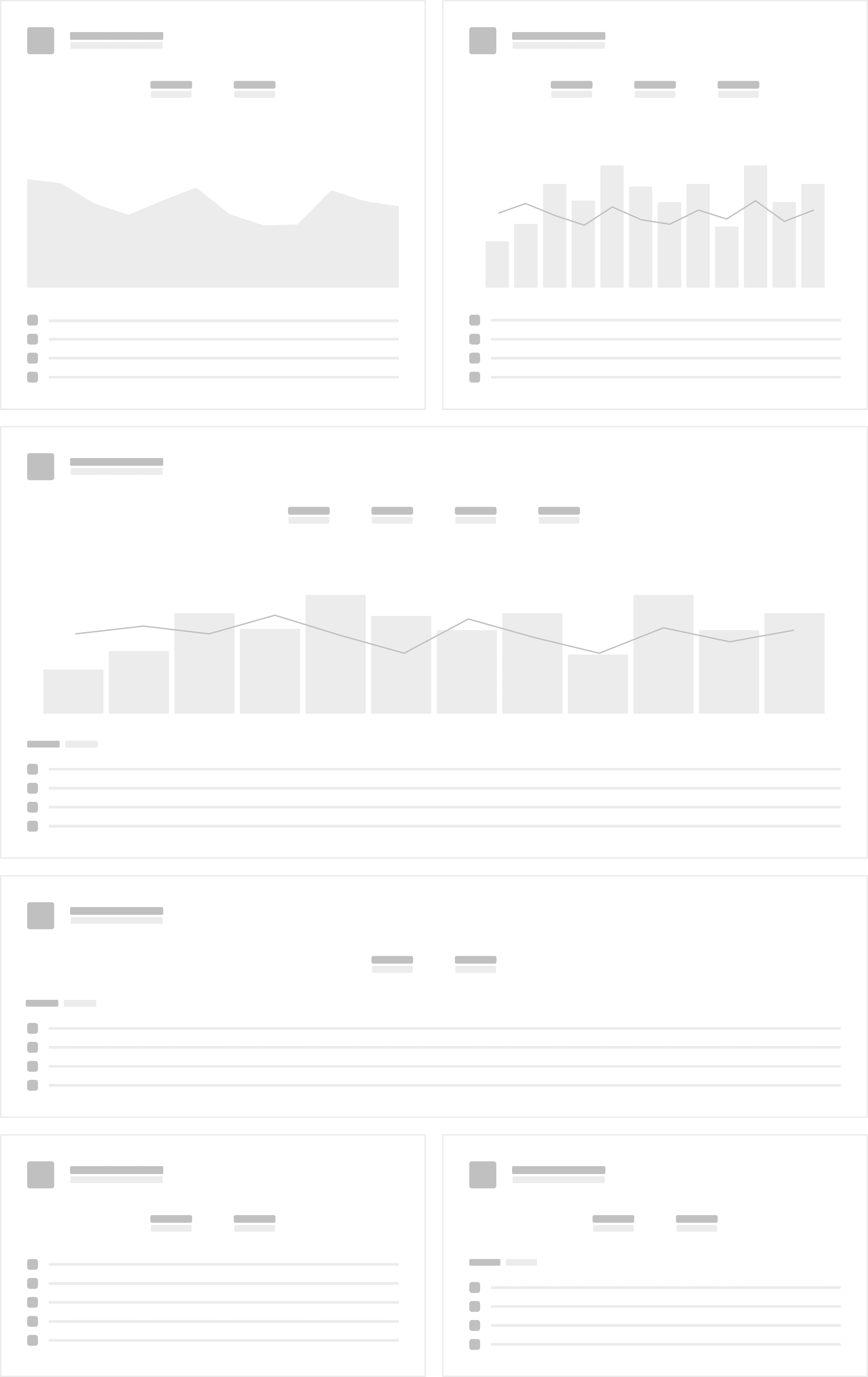
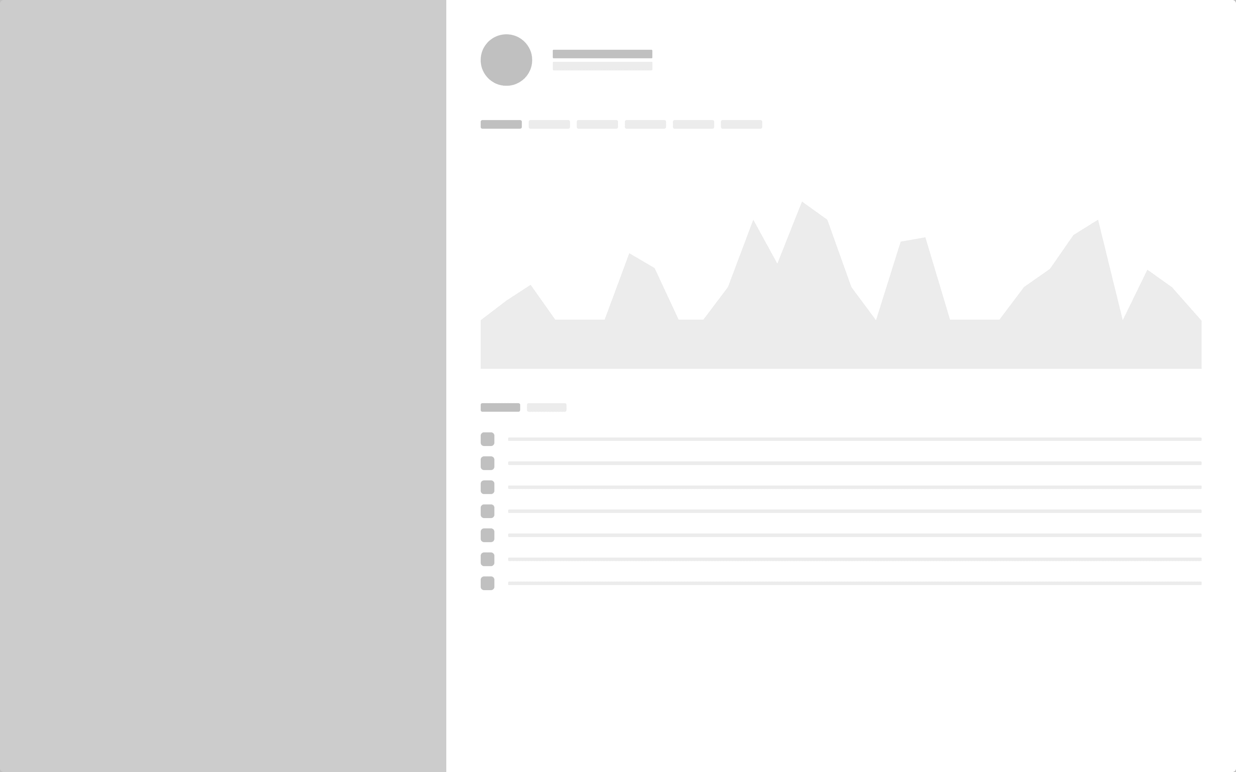
Following data visualization and clarity principles, we opted for a flat design with white space, sleek design and suitable charts.
Dashboard
Provide high level overview of customer interaction.
Customer Info
Provide a holistic tracking on a customer
Demo Walkthrough
Provide a walkthrough data in each widget
Final Design
10
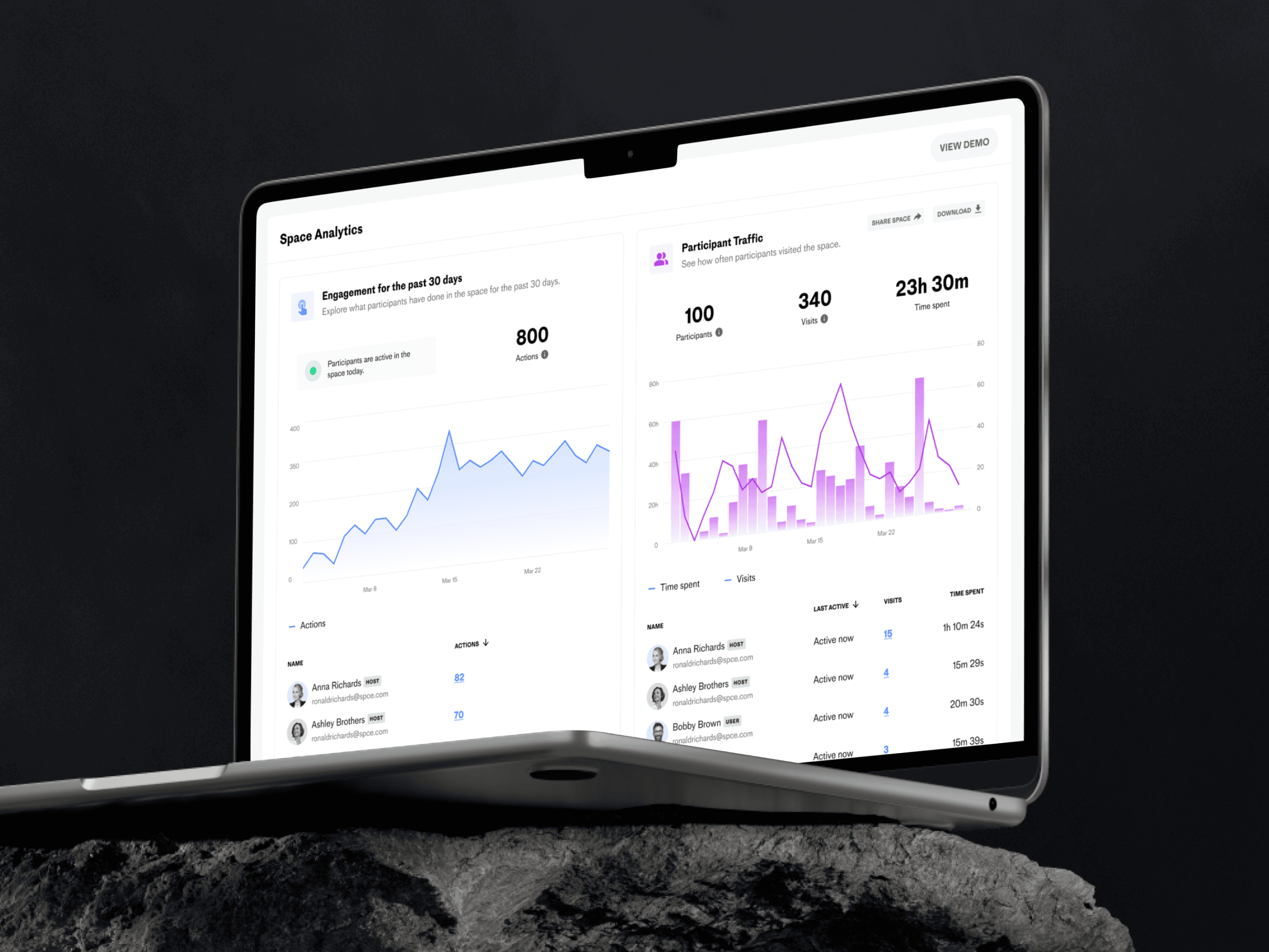
We focused on establishing relevant and clear data hierarchy and using visual cues like color and typography to direct user’s focus.
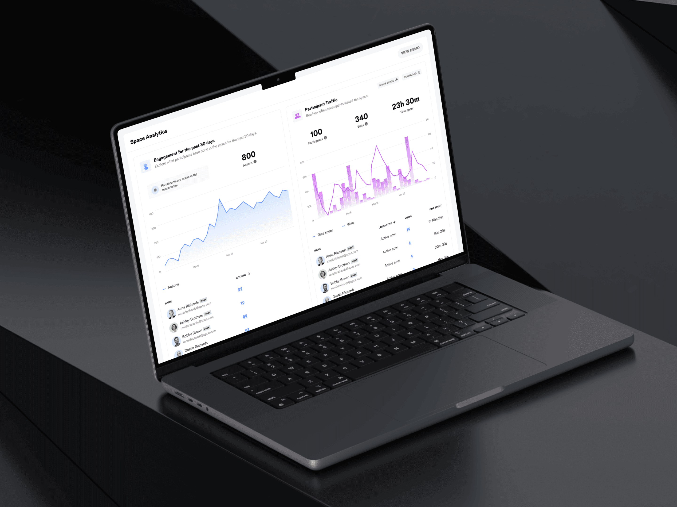
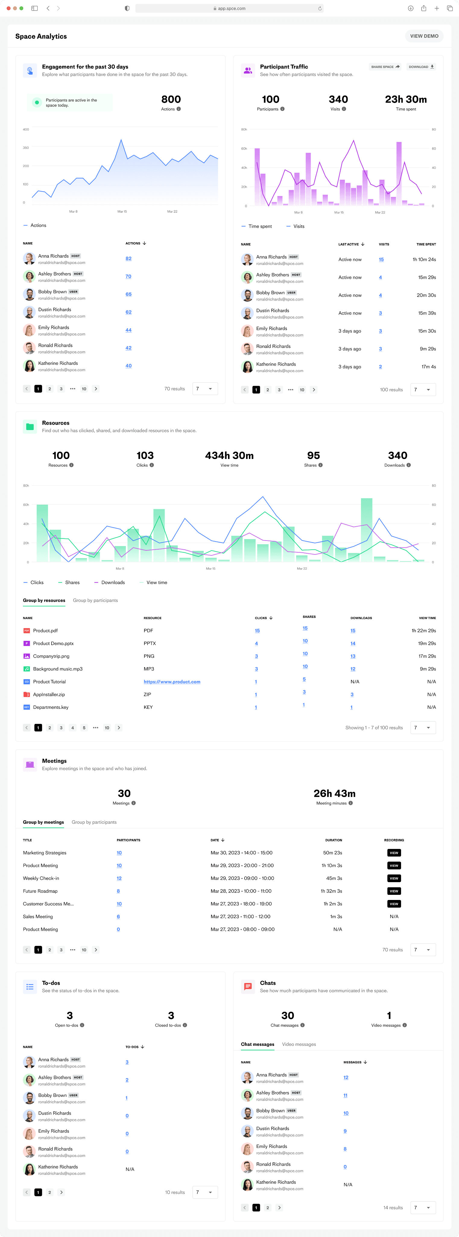
Dashboard
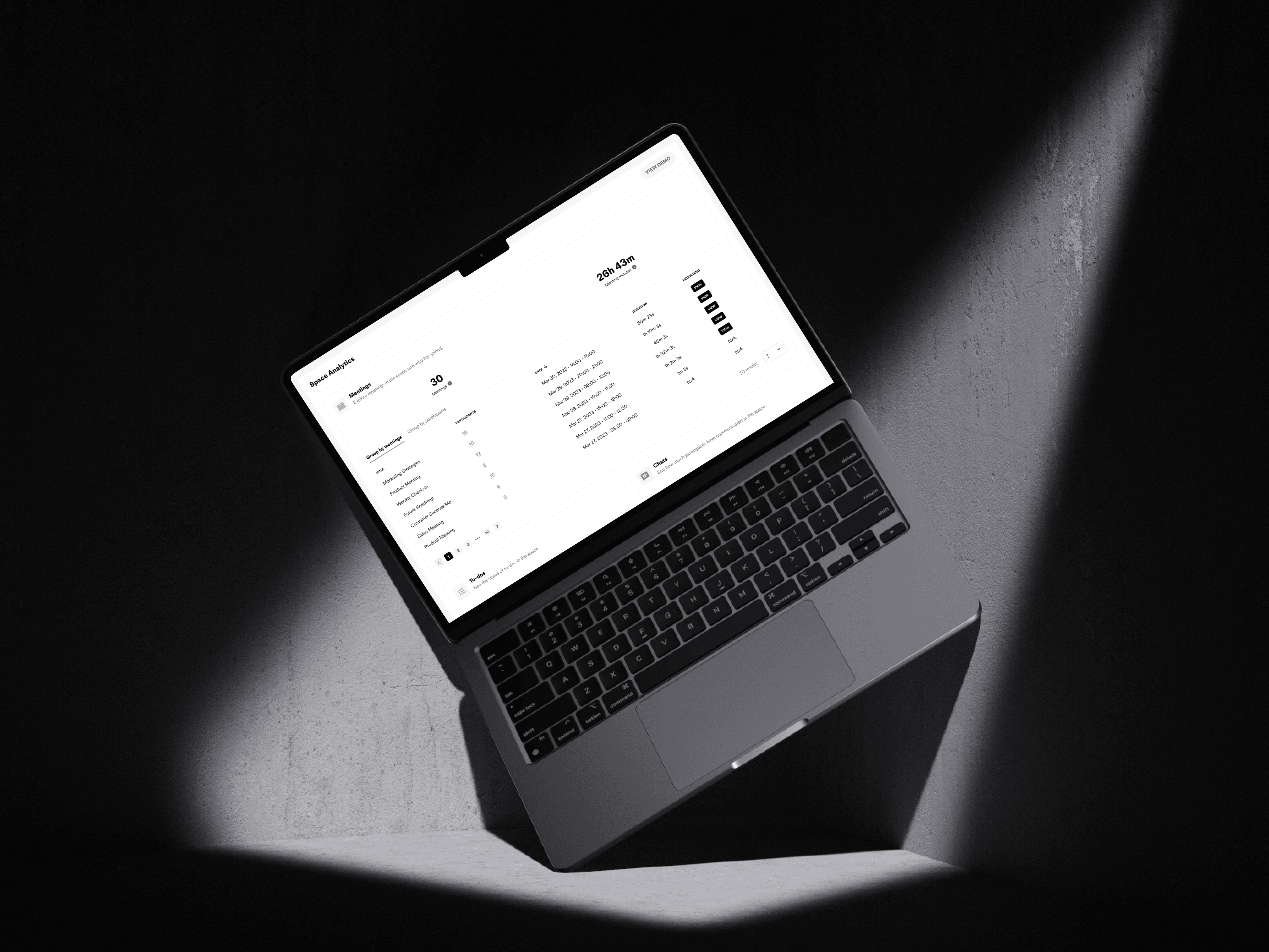
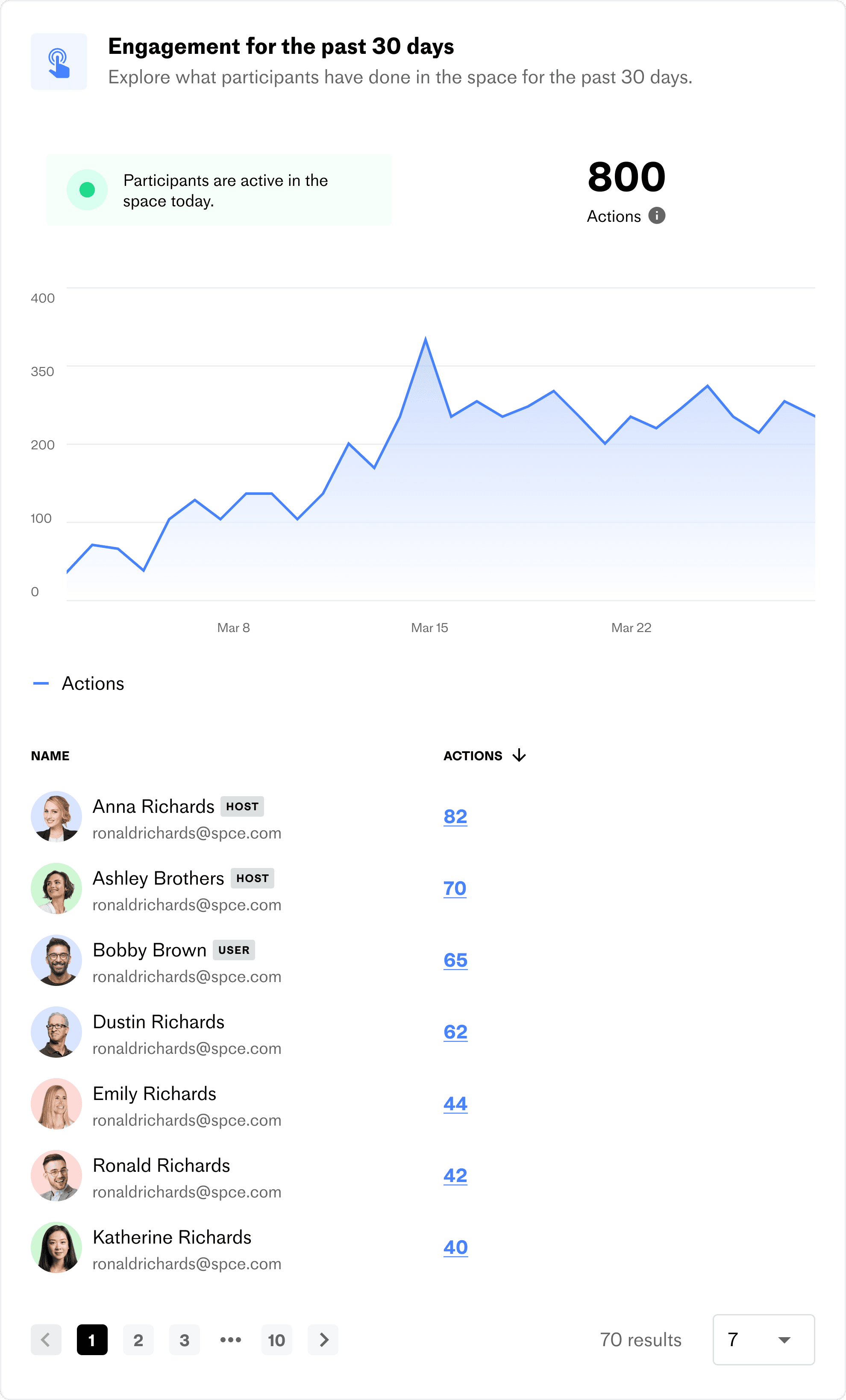
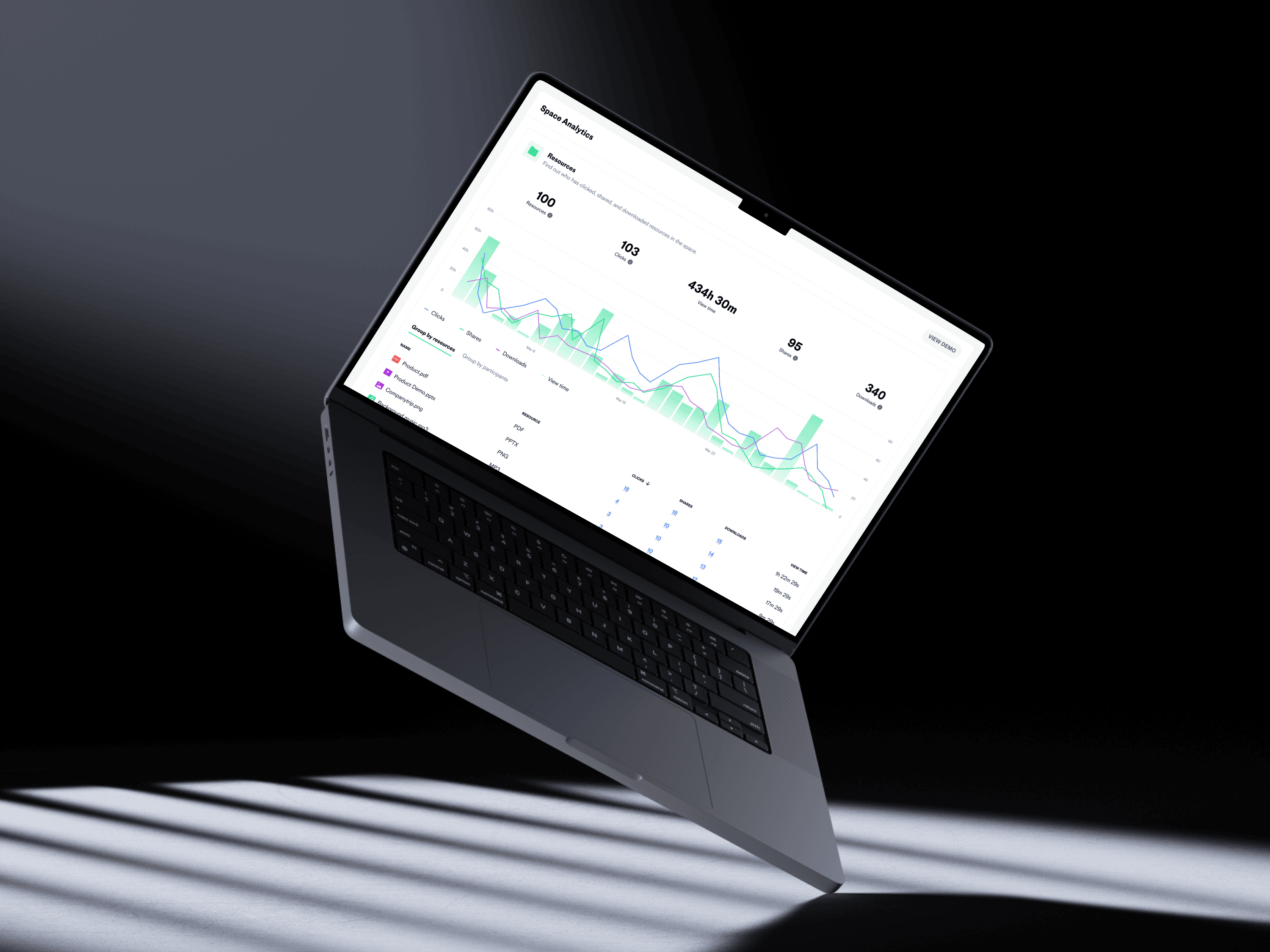
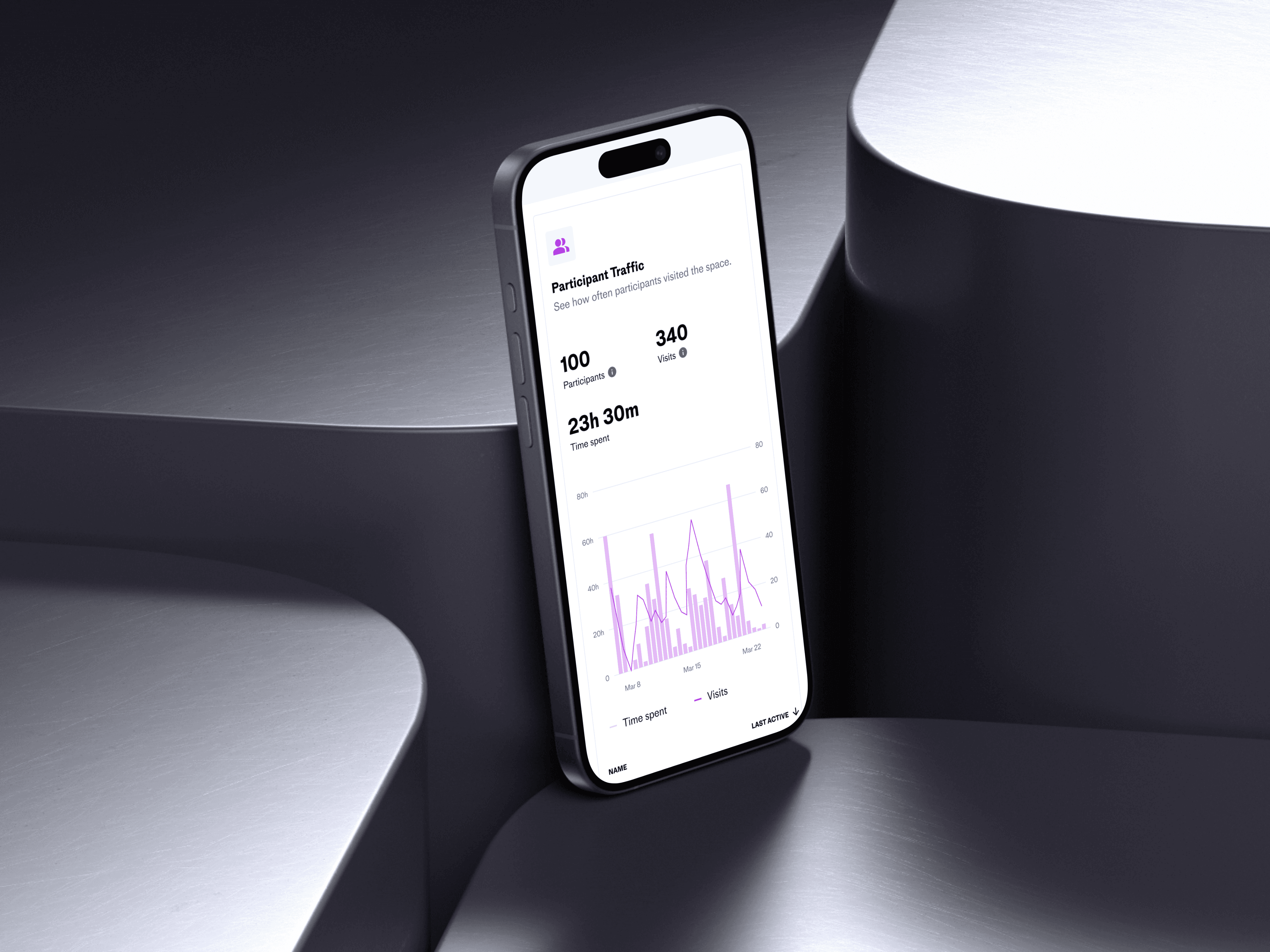
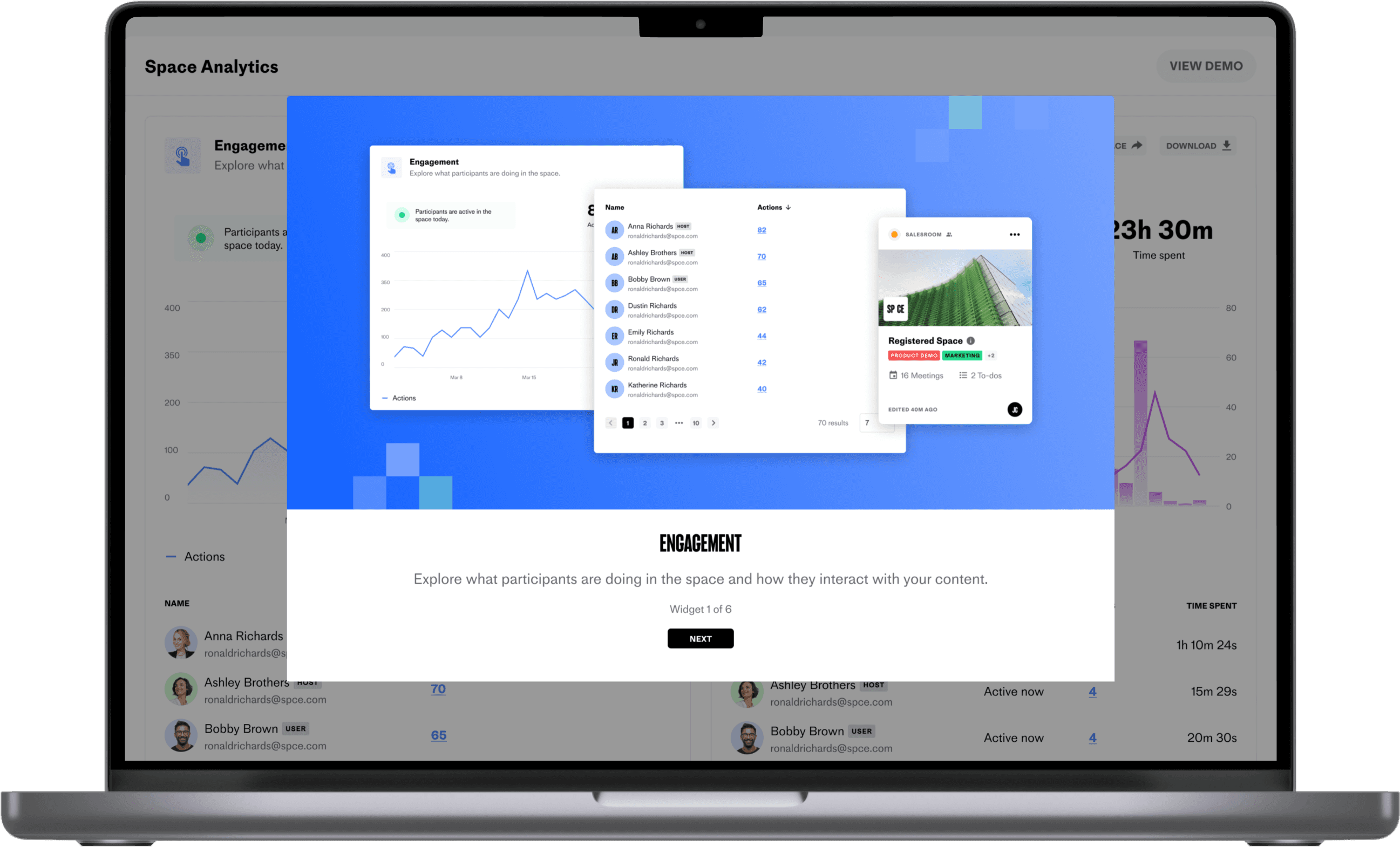
The dashboard provides users with a comprehensive view of customer interactions, including real-time updates on actions taken, visits, time spent, resources, meetings, to-dos, and chats.
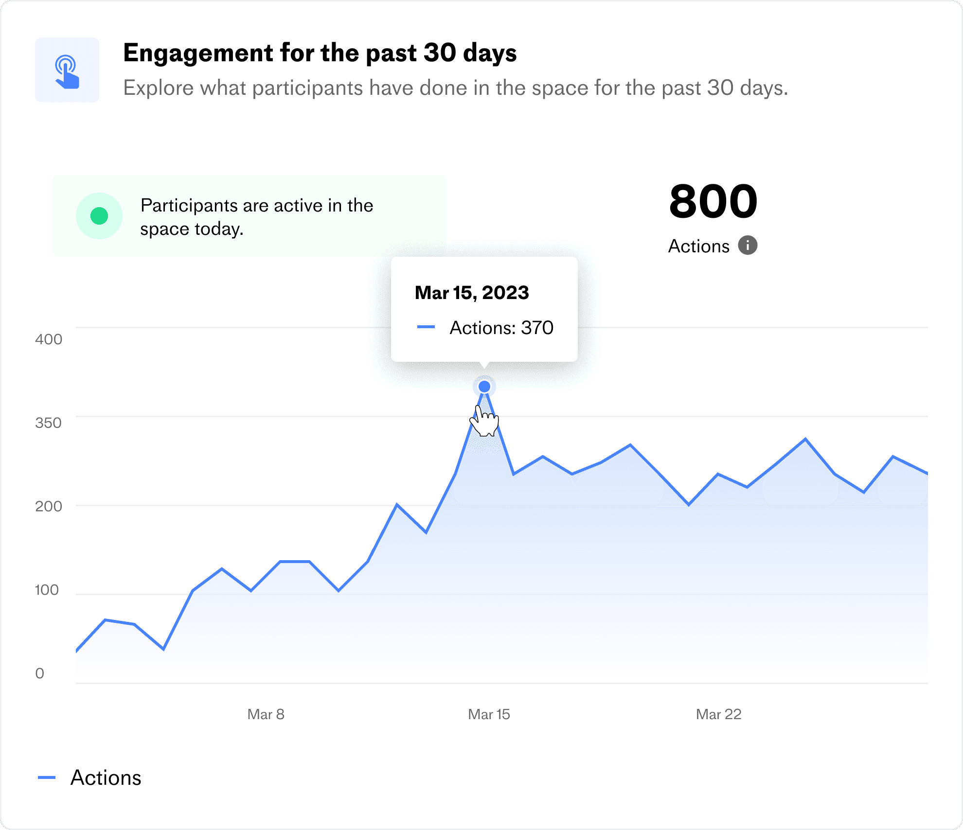
Interactive graph
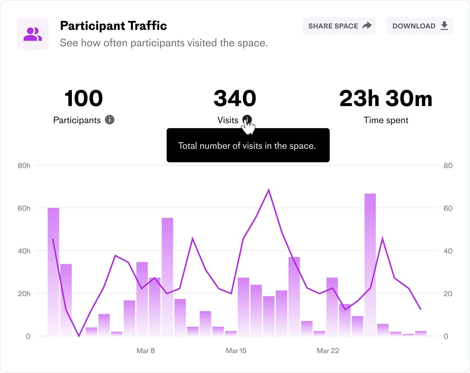

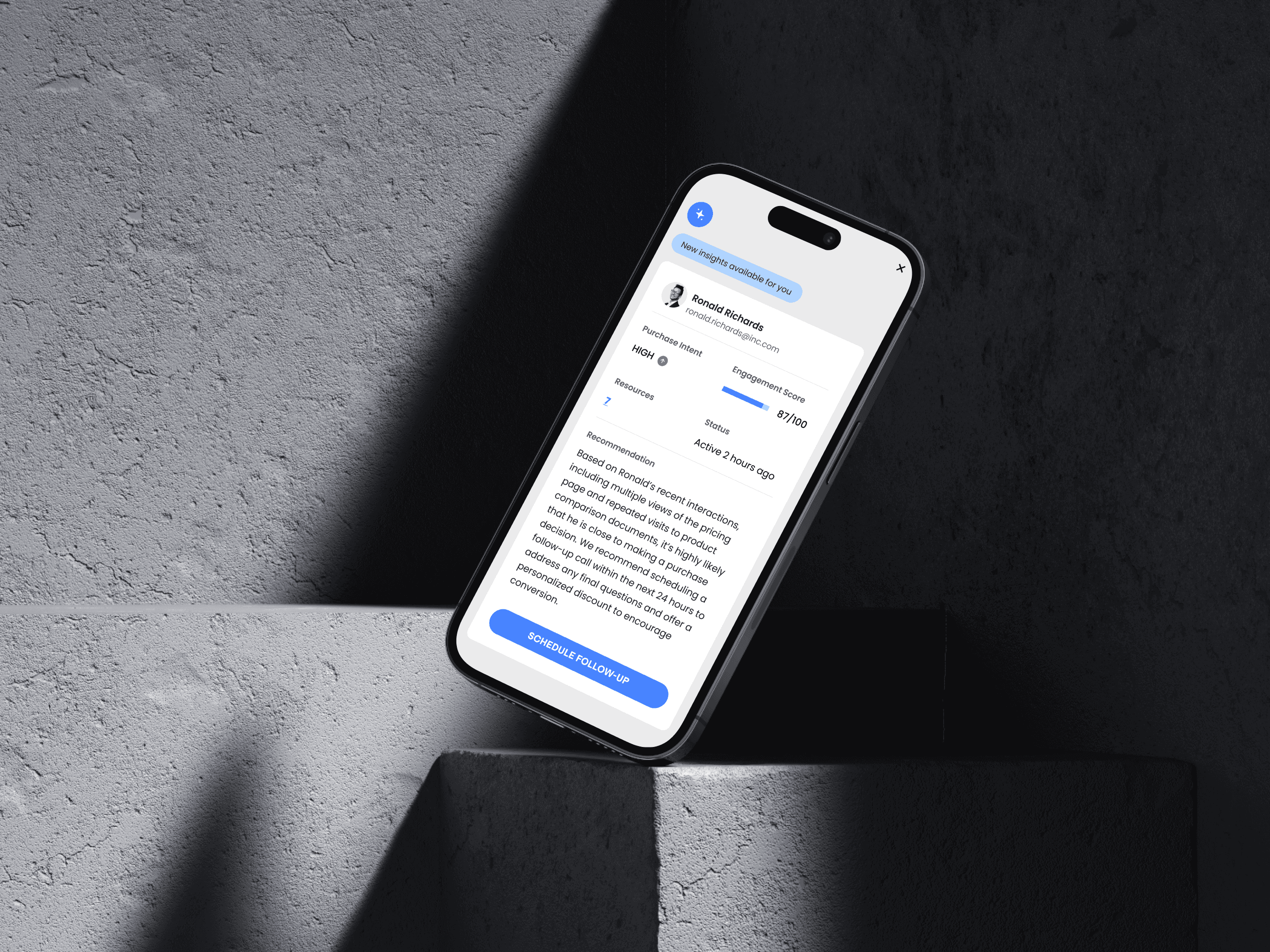
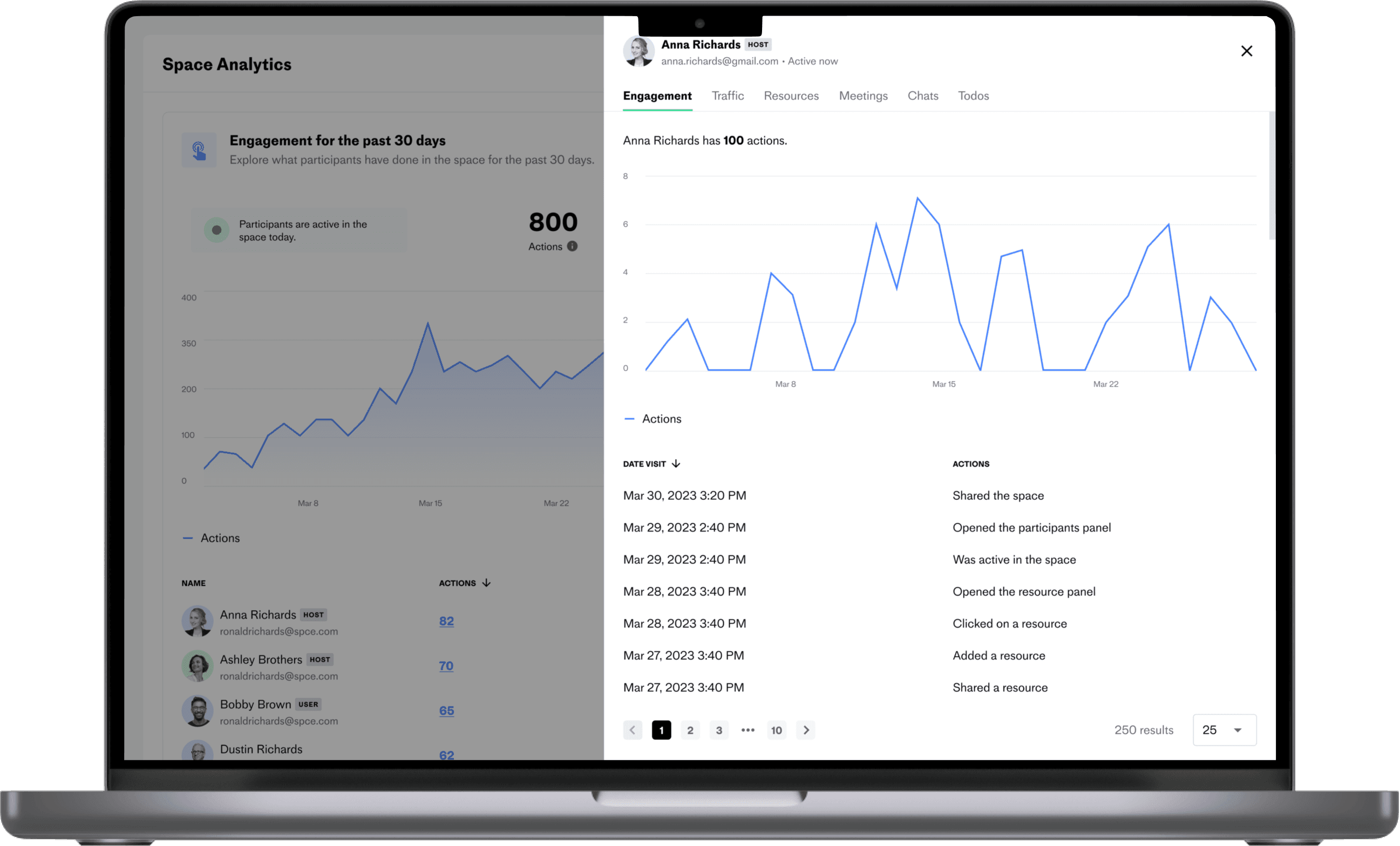
Customer Info
This feature lets users track all interactions of a single buyer, offering helpful insights and enabling personalized experiences throughout the journey.
Demo Walkthrough
An interactive walkthrough that explains each widget with popups, helping users quickly understand the dashboard’s features.
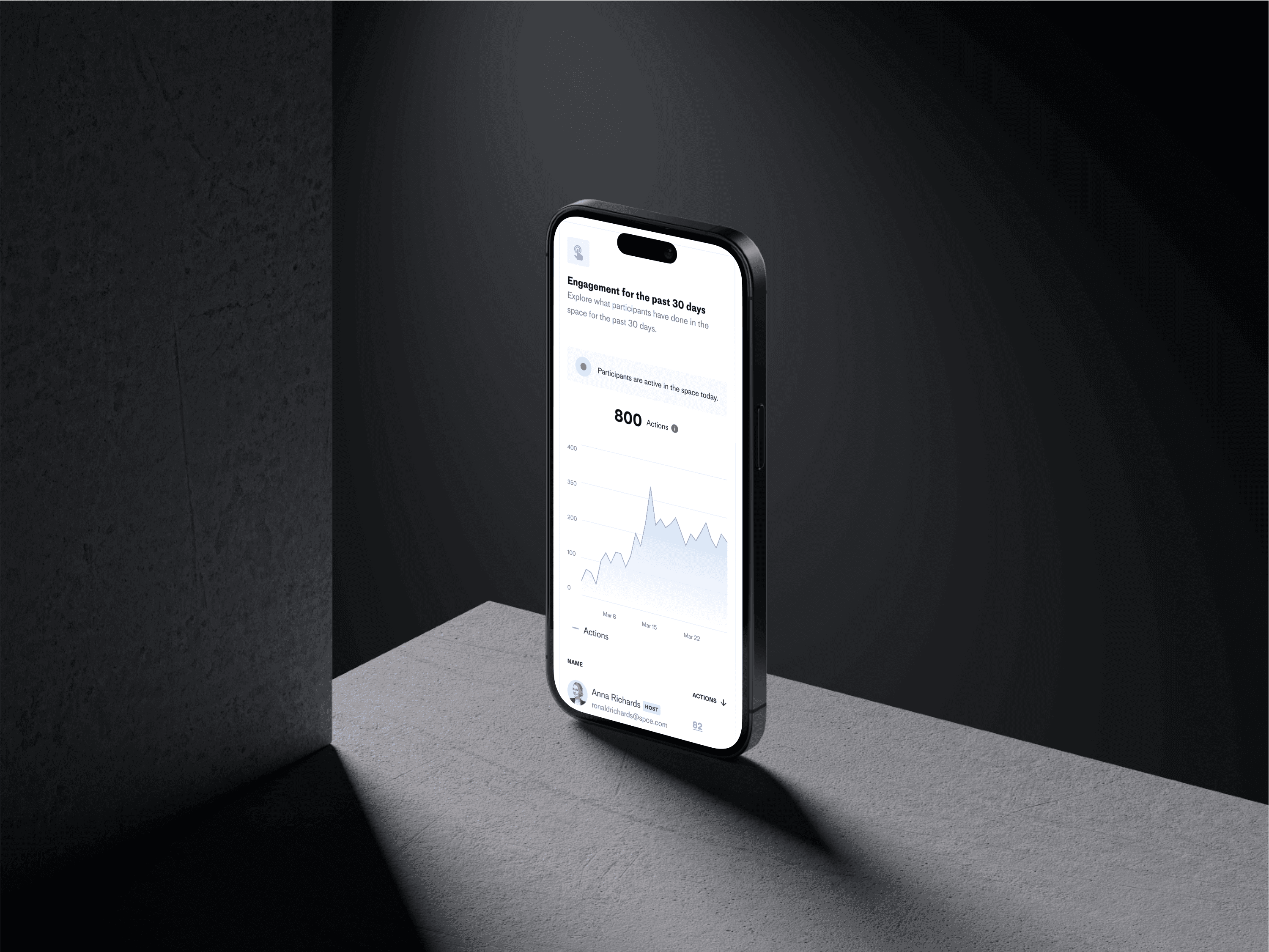
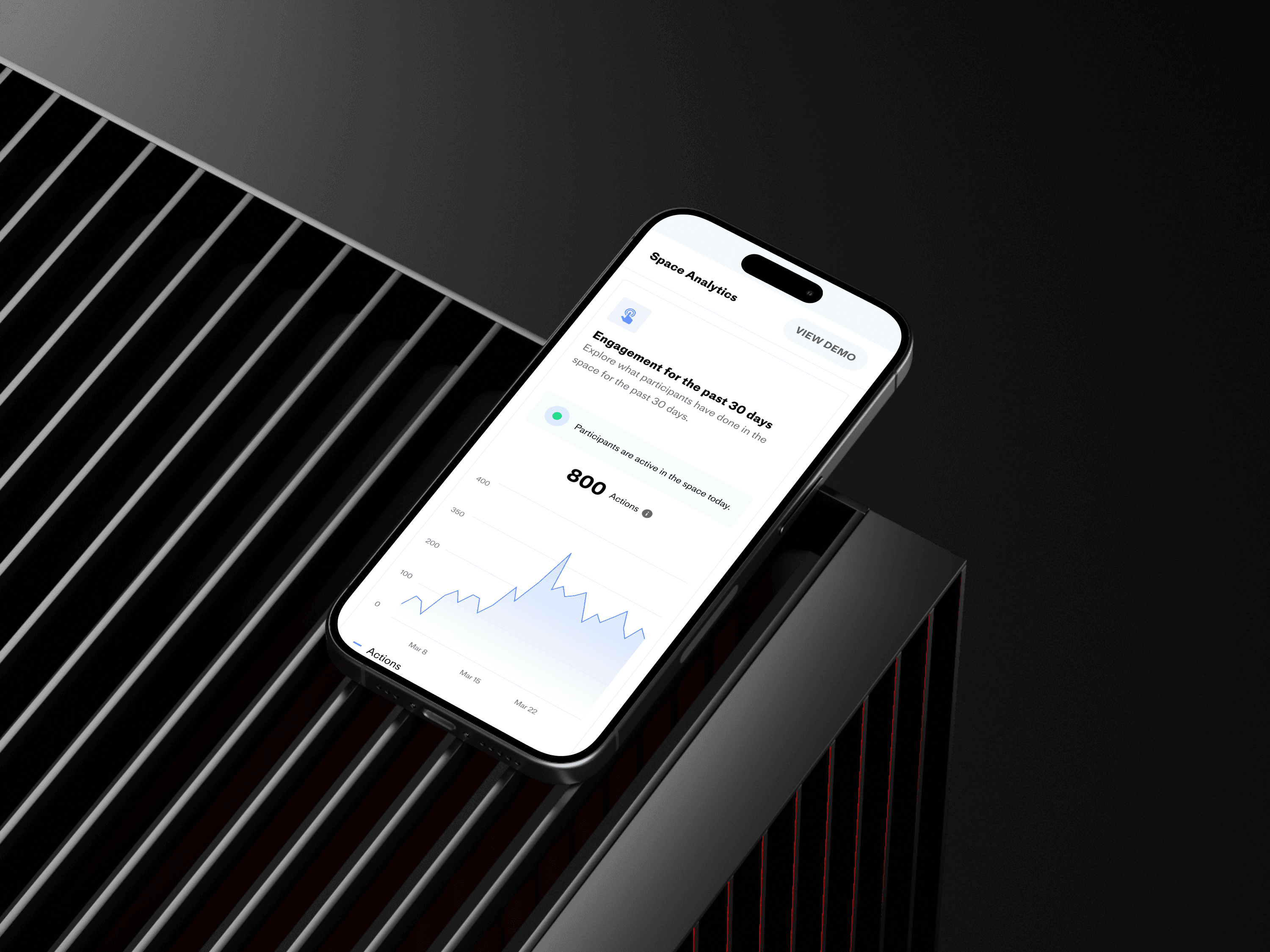
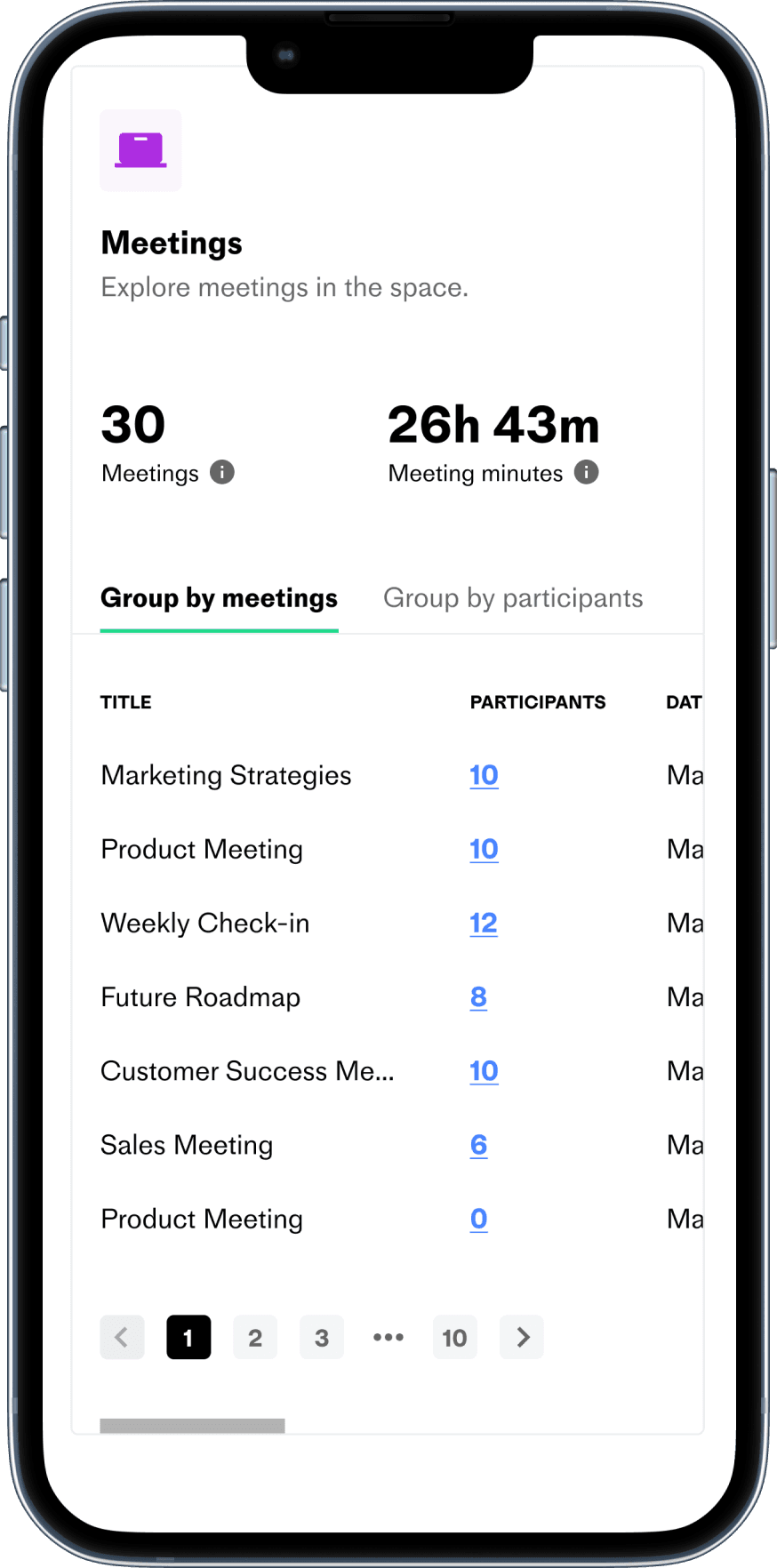
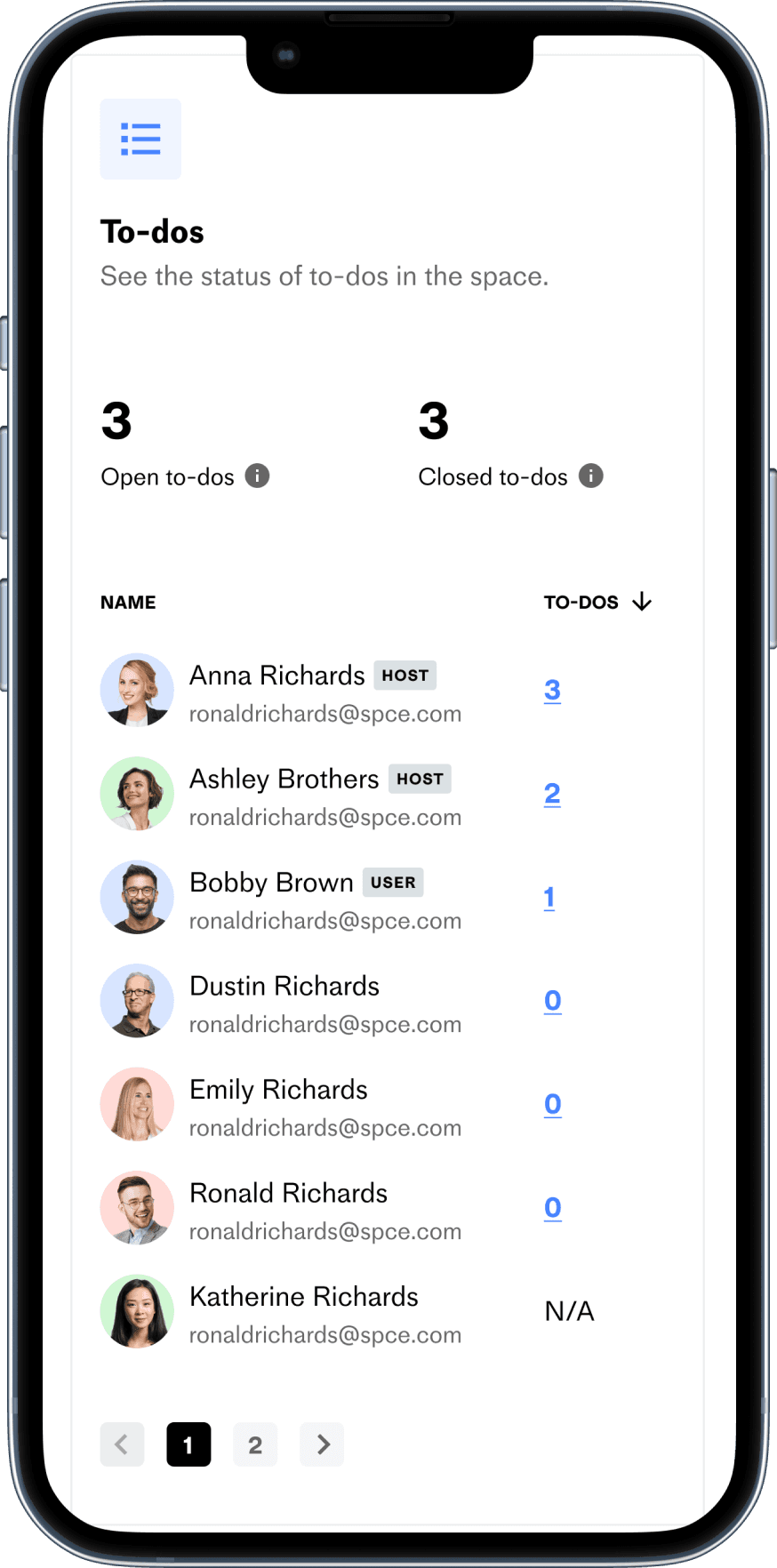
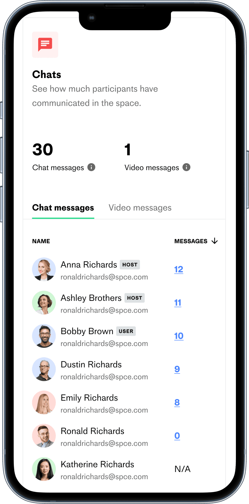
Mobile Adaptation
We wanted to ensure users could view analytics on the go, enhancing flexibility and productivity by providing a seamless experience across devices.


design handoff
11
Getting the approval from the leadership, I hold kick-off meeting to present the final solutions to the engineers.
Deliverables
Once the final designs were ready, I prepared the Figma files, user stories and design documentations.
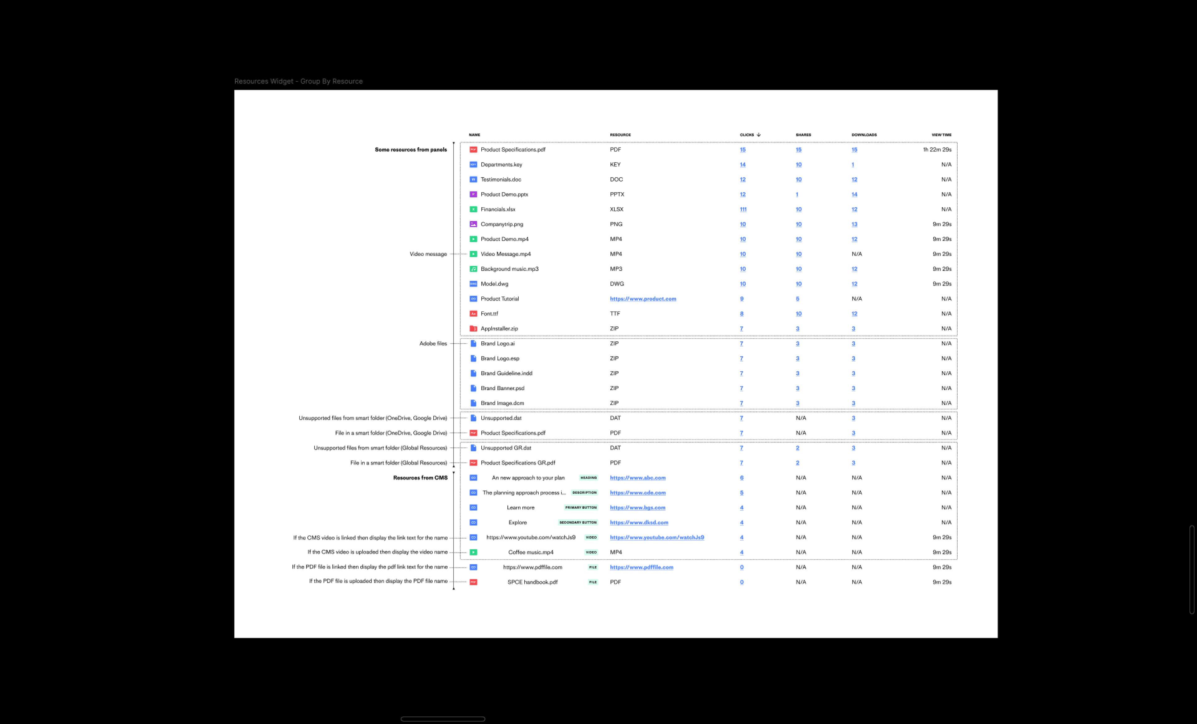
An example of documentation for tracking resources (clicks, shares, downloads, view time) that was aligned with developers prior to the implementation phase:
Monitor
Besides daily stand ups, I worked closely with the engineers to cross check product implementation with the final designs.
Results
13
I led the project to redesign the outdated analytics dashboard that was first release in 2021.
Outcomes
We delivered a user-friendly, intuitive dashboard that is visually appealing and tailored to meet users’ needs.
240+
Hours spent
40+
Screens made
4
Sprints
8
Team members
Business impacts
The project brought positive Impacts on key business goals.
Feature adoption
The feature is adopted strongly by users.
Usage frequency
Retention
Positive impact on customer retention.
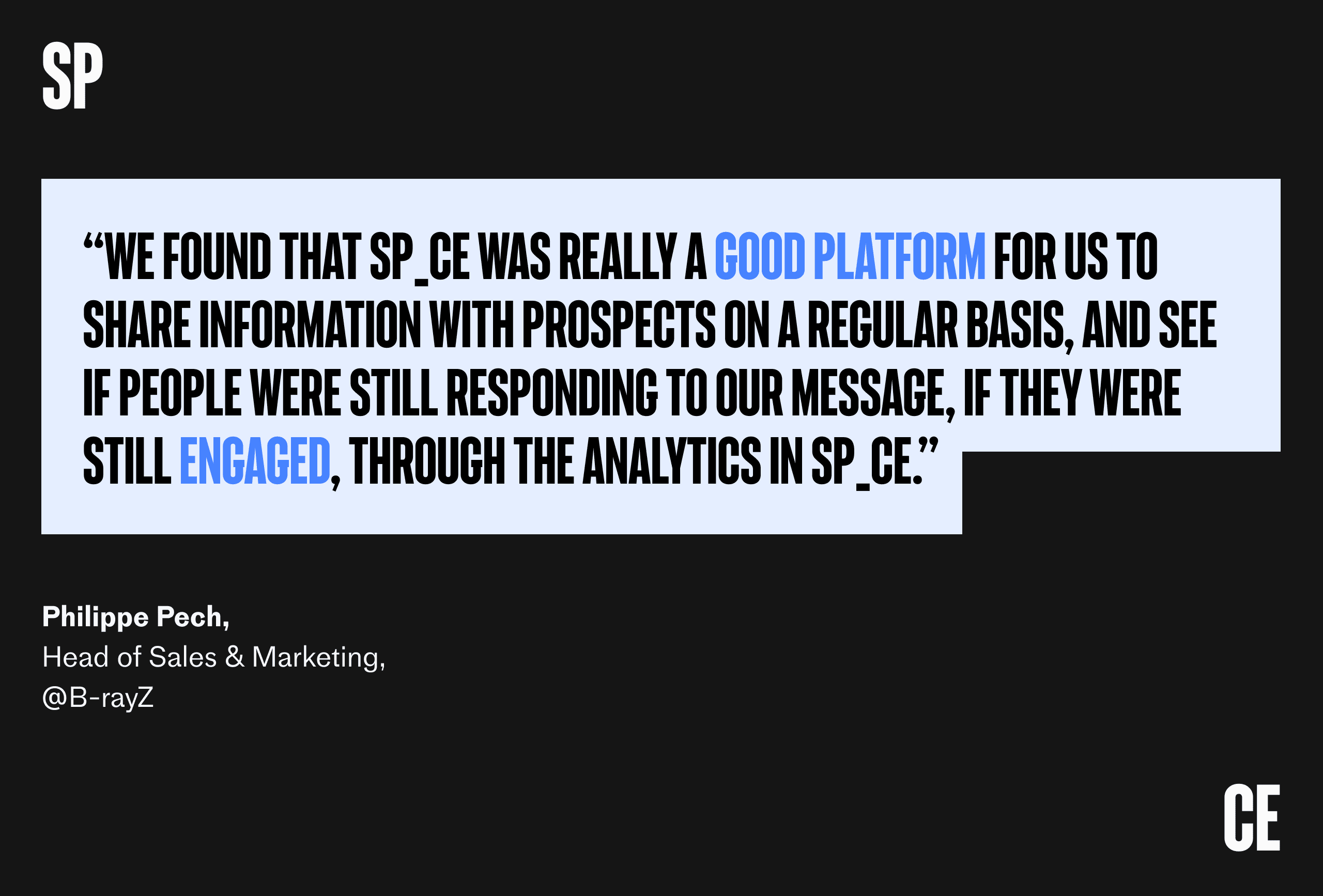
Customer feedback
The new analytics feature has received overwhelmingly positive responses from customers.
key takeaways
13
Thanks to the team’s commitment and effort, we completed the project on schedule, boosted business metrics, and created a robust user experience.
Logic comes first
Although diving into design is my favorite part, the project progressed smoothly because we started off on the right foot by establishing a solid foundation for data tracking.
Show relevant data only
While data is valuable, an excess of it can become overwhelming and make it difficult to identify key trends.
What’s next
14
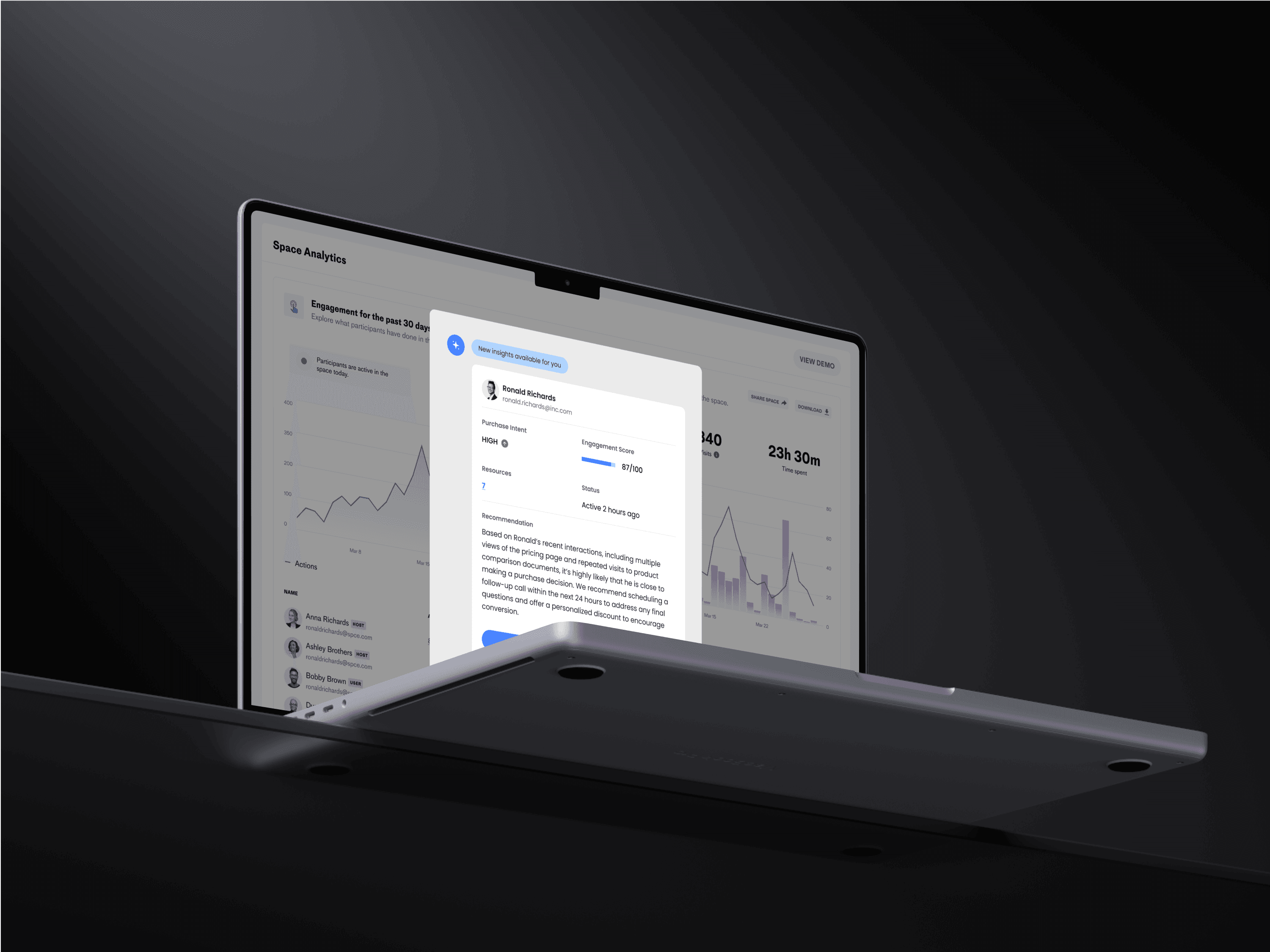
We aims to leverage AI to extract insights from the data, predict buyer’s intent and guide sellers on the next steps in the sales cycle.
